Monday, August 27, 2012

The Truncation Talk-- Why, Where, and How!


Pin It!

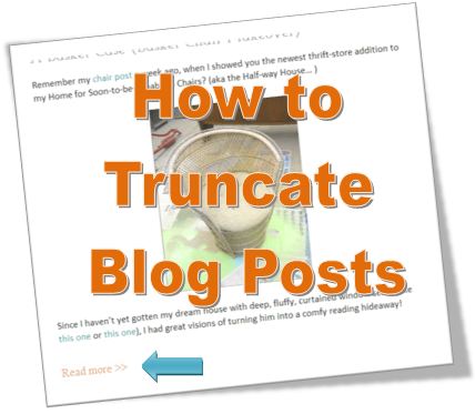
"To truncate, or not to truncate?" If you are a blogger, you've probably asked yourself this question. To me, the main goal of truncating (i.e. showing only portions of each blog post on the main page rather than showing the full post) is to make it easier and more desirable for readers to read MORE of your blog posts.

So, last week I put out a plea for your opinion on whether or not truncated posts made you more or less likely to actually read each article. The "official" poll results were close-- but what really surprised me was the strength of negative feelings against showing only short post previews! One reader used these words, "I hate it... I like to see the pictures first then read and with truncated posts you can't see the pictures! I usually just leave those blogs."

Now me? It doesn't really bother me to have to make another mouse click to read an article-- however, I do understand that a short preview might not be enough to "pull you in" and make you want to actually read the post. Which, obviously, results in less people reading your blog, which is the exact OPPOSITE of what we are trying to accomplish here! :)


So hence the predicament that I think all us bloggers face...

OPTION A:
Show each post in its entirety (and risk losing readers who don't want to scroll waaaaayyy down to find the next post),
 
or
 
OPTION B:
Show a little preview of each one (and risk losing readers who aren't drawn in by the first paragraph of the article)?
 
 
The more I thought about it, I realized that the biggest thing I hated about scrolling through long posts was having to read through the same set of link party links at the bottom of each and every post! Now, I could do what I have done before, and place all the links at the bottom or in a sidebar-- or I could do like some blogs have done, and dedicate an entire page to "Places I Party!" But many link parties are now requiring that you have their link directly IN your post, so neither of these options work well for me.

So I've struck on a middle-ground solution! Call it Option C:

 Truncate at the END of each post, but before the party links!


This way, the entire post shows on the home page-- minus those annoying links! There is less to scroll through, and there are no extra clicks required to read the post! And if you really want to see "where I party", you can click on the link and view the full article (and the pesky link party police will still find the links directly in the post!)

So by tweaking the "WHERE" of truncating (at the end of the post vs. the beginning), I think I have accomplished the "WHY" of truncating: making it easier and more desirable for readers to read my posts.

Now for the important part: HOW to truncate your post! Whether you choose to truncate after the first paragraph, or at the end of your article, there are two methods.

1) If you use Blogger or Wordpress.
This is the easiest-- just set your cursor on the part of your post where you want the "Read More" link, and click on the "broken page" symbol in the bar above (in Blogger, it's called "Insert Jump Break", in Wordpress it's the "More button").

Blogger
WordPress

You'll get a gray line that looks like this (if you're using Blogger):

 
(In Wordpress, it will look like this:)

But when you publish your post, it will look like this (only when viewed on your home page, though-- when you click on an individual post, you will only see the article's text):

If you are using Blogger, you can change the text of the "Read More" link, by going to "Layout", and clicking the "Edit" button on the "Blog Post" section:


Type the text you want to see in the "Post page link text" box (as you can see, mine says, "Where I link up >>"):


TADA! Oh, make sure to save your changes... :) (Don't ask me how I know!)

(If you're using Wordpress and want to change the text of the "Read More" link, you will need to use HTML-- see below)

Now when you look at your blog home page, you will see a link at whatever point you placed the jump break, which will then take you to the full article!

2) Using HTML.
If you are using HTML to write your post (brave soul!), you just need to place the <!--more--> tag at the point where you want the page break to be, like this:


To customize the text that it displays, simply type your chosen text in, after the word "more" and before the "-->", like this:


TADA! You have successfully customized your page break text! (The downside of using HTML is that you do have to type the text in on every post, unlike Blogger where you can choose an automatic page break text)

Please note: I use Blogger, so I have no real experience with either HTML or Wordpress-- the information of that portion of the tutorial came primarily from here .

So, does truncating still scare you off? "Why" and "where" do you truncate, if you do? What do you think of Option C?


Monday, August 20, 2012

A Basket Case (Basket Chair Makeover)

Remember my chair post a week ago, when I showed you the newest thrift-store addition to my Home for Soon-to-be-Rehabbed Chairs? (aka the Half-way House… )

Since I haven’t yet gotten my dream house with deep, fluffy, curtained window seats (like this one or this one), I had great visions of turning him into a comfy reading hideaway!


One can of gray spray primer, and four cans of Krylon Bright Idea Yellow later, he was ready to take his place in the real house! This is how he looks now, all “cozied up” in his new home:

A few wicker painting tips:

1)      Use a spray paint with primer built in (I doubt it would have taken four cans if I had done this!)

2)      If you do choose to do an initial primer-only coat, use a primer color that corresponds with the shade of your final paint color (i.e.  if your final color is going to be yellow, use white instead of dark gray primer!)

3)      Forget the “many light coats” rule that usually applies when painting furniture… go thick and heavy! This is one case when runs are not bad! After three cans of “light coats” that only touched the same parts each time and left the rest bare, I went thick and heavy with the fourth (and thankfully, final) coat—spraying it heavily enough so that it ran down the caning and filled in the cracks. TADA-- coverage achieved!!!

This is what the corner of my dining room looks like. You’d never know that, tucked in between the piano and the bookshelves, is a secret reading space!

I love my new reading nook!  


P.S. I am also loving my new “You Are My Sunshine” pillow! Check out how I made it (out of a recycled quilt!) here.

Thursday, August 16, 2012

To Truncate, or Not to Truncate?

THAT is the question! (No offense to Hamlet...)


You may have noticed that I went through and truncated each of my posts (i.e. made Blogger display only the first paragraph or two of each post on my blog home page), so that now you have to click "Read More" in order to read a whole post. The question is, is this a good change, or a bad one?

When I first started seeing blogs with truncated posts, it bugged me to have to clickto read a post (a whole extra finger movement... sheesh!) Now, however, I appreciate not having to scroll down/back through dozens of posts to find the one I'm looking for.

But what do YOU think? Yea, or nay? If you can see multiple posts at a glance, are you MORE or LESS likely to click and read an entire post? Thanks in advance for the input!


Wednesday, August 15, 2012

DIY "You Are My Sunshine" Reversible Pillow

Did you ever have a project practically design itself in your head, but you were too chicken to try it because you weren’t sure your skills were up to the task? Yep, that’s me—most of the time. But this time, when an idea for an appliquéd reversible pillow jumped into my head, I took the plunge—in spite of the fact that I had NEVER even sewed a pillow before, let alone appliquéd anything! I can be so naïve sometimes… LOL :)  (Of course, it helped that I already had my sewing machine out for another project!)

Before I hardly knew what I was doing, I had a pillow form out, along with a quilt/blanket (that I had picked up at Goodwill solely for its gorgeous colors/pattern combos) that I thought would make a good premade background :) I folded the quilt over at a point that left a mostly “blank” front panel, and a multi-patterned back. Then I cut a square out just barely larger than the pillow form, leaving the folded edge uncut (no measuring or tracing here—I was on a roll! At least I remembered to take a few pictures!) I flipped the panel inside out and sewed up two of the remaining three open sides, leaving one open to get the pillow form in.

I used white iron-on letters (that I had bought for a different project) to form the “You Are My”… but I didn’t have anything big enough for the “Sunshine”! Nor am I the privileged owner of a Silhouette or Cricut machine with which I could have easily cut them out (of course, if someone has an extra one that want to send me, I am always accepting donations!) :) So I made the blue letters the hard way—I used my computer to create large block letters approximately the size I wanted, and printed them out. Then I cut each paper letter out with scissors, traced them onto another piece of fabric from the quilt, and cut each fabric letter out individually. Not an easy task! (But, as I was soon to discover, it was not the hardest part of this project!)

I cut the little bird out of two different fabrics (also cut from the quilt), using this template from Charcoal & Crayons.

The iron-on letters were easy to adhere, but I had to figure out how to hold the blue letters, as well as the bird, on to the pillow. I knew I wanted to stitch them on, but I needed a way to hold them in place while I did so.  The solution: my trusty glue gun-- “basting” the letters in place with tiny dollops of glue! (As a matter of fact, the hot glue ended up holding much better than the iron-on lettering!) Then it was back to the sewing machine to zig-zag stitch first around the bird, and then the blue lettering. Unfortunately, it took me quite a bit of time—and frustration—to get the stitch width & tension ratio right - one that kept the stitches tight enough without constantly breaking the thread! Arghh!

Finally (after over an hour of sewing, seam-ripping, thread-cutting, needle-rethreading, and re-sewing) I got the blue letters “stitched”. Unfortunately, by this time, the iron-on letters were coming loose because of all the fabric wrangling—so I had to sew them on as well (this time stitching just inside the edge of the letter, so the stitching wasn’t as obvious)!

By this time I was QUITE sick of my sewing machine, but I still had to figure out how to close up the open end of the pillow cover. I considered buttons, and even a zipper (DEFINITELY beyond my skill level)—but in the end, the easy way won out again: my trusty glue gun! I simply folded over the open side like I was wrapping a present, and hot-glued the edges down! Tada!

Here is what the back of the pillow looks like (I told you it was reversible!):

All in all, I am pretty happy with my spur-of-the-moment, waaayy-above-my-skill-level project! I think the imperfections add to the whimsical, primitive charm (at least, that’s what I keep telling myself! Just don’t look too close…) :)

FINAL BREAKDOWN:
Pillow form: $1.00 (thrift store)
Quilt: $3.99 (thrift store)
Iron-on letters: 2 packs @ 3.99 ea + 40% off Jo-Ann Fabrics coupon = $4.79
Doing something that I didn’t think I could do: PRICELESS


So what are you waiting for? What project is scaring you away? Get out there and prove that nagging doubter in your head wrong!!! :)


five days five ways | because every day is different

Monday, August 13, 2012

Chairs, Chairs, Everywheres!

I think I may have a chair problem. As in, I love them too much! I just made the discovery that I have at least EIGHT chairs sitting in my “project room” waiting to be given new life! :) And all of them are waiting for me to make the decision of just how to remake them!


You see, the biggest problem with redoing furniture on a budget is not buying the furniture itself, but finding the right products for the makeover at the right price! If you're not very patient, the price of the fabric to redo a chair can far exceed the cost of the chair itself! Hence my stash of chairs-- most of them are waiting, not only for a final decision on how I want to redo them, but for the perfect fabric with which to bring them back to life (preferably at a minimum cost!)


My first contribution to the stash was these dining chairs (and their 3 identical friends), which I brought home in my giant rummage sale haul! They are waiting for me to either 1) find the right fabric to redo the seats in, and then paint the wood (in a to-be-decided color: pale green, like these? Light aqua [like these]? Or plain white?), or 2) make white linen/dropcloth slipcovers for them (like these), and leave the wood & seats untouched.
The next addition to the hoard was this lovely wing chair, which I snagged at Goodwill for $9.99! She/he is extremely solid, and the upholstery is in great condition except for one cigarette burn on the seat back, and the usual wear on the arms and edge of the seat.  I am having a difficult time deciding whether to try painting the fabric, like this beauty (and risk not being happy with the results and wasting the money on the paint), or going ahead and buying fabric and making a slipcover (which, with my rudimentary sewing skills, would be quite an undertaking). So more decisions!
But my latest chair infatuation is with this beautiful basket chair! I actually spied it at Goodwill last Monday, with a price tag of $12.99. It is pretty gray and weathered from age, but the wicker itself looks all strong and intact. I left without it, but kept thinking about it all week long (my #1 criteria for buying a “pricier” item—it must be something I can’t put out of my mind!) For me, it brought back some of my very first memories, of swinging with my Grandma in a hanging basket chair. :) I also sat in it to “test” it out, and knew it would be a great curl-up-with-a-book-in-a-corner chair!

 So as soon as I could, I hoofed it back to Goodwill! The chair was still there, but the price tag was missing. So I carried it up to the front, and asked the cashier if they could retag it for me. She very nicely went back to ask the “price-person” how much it used to be. When she came back, she told me, “Well, he said he put $9.99 on it… but I think it’s pretty worn, so I’ll say $5.99!” Of course, I smiled, and nodded (all the while, my inner child was jumping up and down and hollering, “Woohoo!!!” I got it for less than half of what I was originally prepared to pay!
Fortunately, this chair seems like it will be a pretty easy makeover. (Fingers crossed!) All that I need to do is decide what color this beauty needs to be spray-painted! Here’s where you can help me… which color you think he should be?
Blue Ocean Breeze, Green Apple, or Lemon Grass?
Just for reference, here is a snapshot of the curtain fabric in my dining room— which also contains the “reading corner”:
Okay, after seeing these together, I have a pretty good idea of what color I’m going for :) Now I just need to find a (CHEAP) way to buy the paint (are there are 50% off coupons for Menards? LOL)
So what do you think? Do I need therapy for my chair addiction? ;) Am I the only one with a "stash" of projects waiting to be redone?

Wednesday, August 8, 2012

Freshening Up My Kitchen

Have you ever had a decoration around for so long that you forgot it was there? Yeah, me neither.

 In spite of my continual decorating change-ups, I’m ashamed to say that the tops of my kitchen cabinets have been touched very little since we got married 6 years ago (yep, six YEARS!)
BEFORE
Okay, I might have changed a few things up here and there-- as I gathered more décor from my garage sale/thrift store shopping habit-- but I know for a fact that the two baskets of plastic fruit on the ends were the original ones I placed up there when I first decorated my house! Yikes! Needless to say, not only were they very dusty, (seriously, who climbs on top of their kitchen cabinets to dust every week?) but they were, well, just boring! It was DEFINITELY time for a décor refresh!


Really, things might still be the same up here, if it were not for this beautiful bird cage! I have oohed, aahhed, and drooled over gorgeous cages like these in magazines for years. A few weeks ago, during one of my regular Goodwill runs, I was getting ready to head for the checkout, but I had this nagging feeling that I was missing something IMPORTANT! (I have that feeling almost every time, but never mind…) I headed across the store to look through the clothes one last time, when what did I spy, perched on top of the clothes racks, but this beauty! I picked it up with shaking hands, thinking, “It’s perfect! Please, oh, please, let it be under $10!!!” Lo and behold, the price tag said $3.99! Needless to say, I couldn’t wait to get it home and find a place for it!


Believe it or not, however, I had a hard time finding a home for it, because it was TOO BIG! I finally decided that it would have to go above my kitchen cabinets—which meant a complete rearranging and redecorating of everything up there! (Not that I was bummed about that…). :) I knew that, like the rest of my living areas, I wanted to get rid of the red accents and go for a lighter, brighter look. So I followed my usual formula for decorating an area:

1)      Remove all preexisting objects from the area.
2)      Raid storage room for any decorative items that might possible fit the color scheme/size/style you are going for.

3)      Move items around and switch them out until you are happy with the arrangement!

 (Usually I repeat steps 2 & 3 multiple times—even days in a row—until I am happy with the results!)
AFTER

As mentioned above, the rest of the items I already had—either found at garage sales or in thrift stores over the years.  I ended up with a gold-and-white “pear” theme of sorts, though that was not really my intention to begin with :) (Okay, there’s one exception: the pot on the left is lemons, not pears…)

I believe the “Café” sign is the only item I bought “new”… and that was in a clearance section because of some missing paint! (Though you certainly can’t tell from a distance!) The gold candlesticks were I think 50¢ apiece at a community-wide rummage sale last fall, and I’ve definitely gotten my money’s worth of use from them since! They seem to find a place in just about every vignette I make!

I really adore the vignette on this side. The old frame came from a thrift store… you can tell it used to be gilded, but most of it has worn away :) I just love that effect! The print inside of it I bought for $1 at a flea market, because I loved the earthy tones.

The small round bird cage was one of my first-ever spray-paint projects! It was brass when I bought it (at Goodwill, of course). I sprayed it first green,  but didn’t like it, so I painted it white, then distressed it lightly with a scuff pad till some of the green showed through. It’s the perfect size for one of the few fake houseplants I still have. (Yes, I went through a big fake plant stage… but I’m growing out of it now!)


I think the refresh makes a big difference—especially since this is the first view you see when you walk in my front door! Now, every time I walk into my house, I smile!

So take a look around your house, and see if you have any decorations or areas you might be overlooking!  You don’t need to make gigantic changes like remodeling or even painting—just change out a few items, and be ready for a fresh new feeling in your home!